Recipient page and link preview in your event's look
Before speakers and guests download their badge, they see two things from you: the preview of your link in the chat and the page where they enter their name and photo. Here's how to tailor both to your event and what to check before you send the link out.
Two places your guests see before the badge
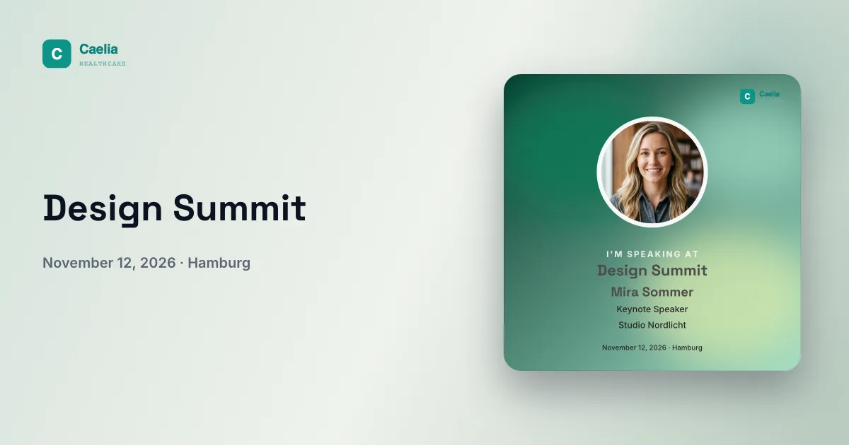
The link preview is the card a chat app or a network shows when you share your speaker link or visitor link. The recipient page is the page behind that link: this is where your guests enter their name and photo and download their badge. You design both in your event dashboard, separately from the badge itself.
Both features need a free account. Without one, the two tiles stay behind a lock. Until then, your guests see the standard page and the card that was generated when you created the event. Guests themselves never need an account.
In the video: a recipient page from start to finish
The video goes through everything once using a sample event: layout, colors, cover image, logo, welcome message and field names, plus the shared selection page for several badges. At the end it opens the page as a guest and downloads a finished badge.
How to open the editor
- Open your event dashboard. The overview contains the “Customize” block with the “Design recipient page” tile. On a phone, you'll find the same block under “Overview”.
- If you have several badges, choose at the top what you're designing: “All badge pages” is preselected, and below it you can pick a single page, for example just the Speaker page.
- Work through the “Design” and “Texts” tabs from top to bottom. The preview shows every change right away. On a phone, “Open as guest” shows the view your guests get.
- Save. Anyone who opens your link after that sees the new page.
If you design one page differently from the others, the editor marks the section in question with “Different from the … page”. “Apply to all pages” or “Same as the … page” brings the pages back in line. Both take effect immediately, and “Undo” stays available for a few seconds afterward.
Design: layout, color style and logo
Under “Layout”, you choose how the page is structured. Which layouts are offered depends on your badge's format: square, portrait, story or landscape. Some layouts have extra slots for text, which you fill in on the “Texts” tab.
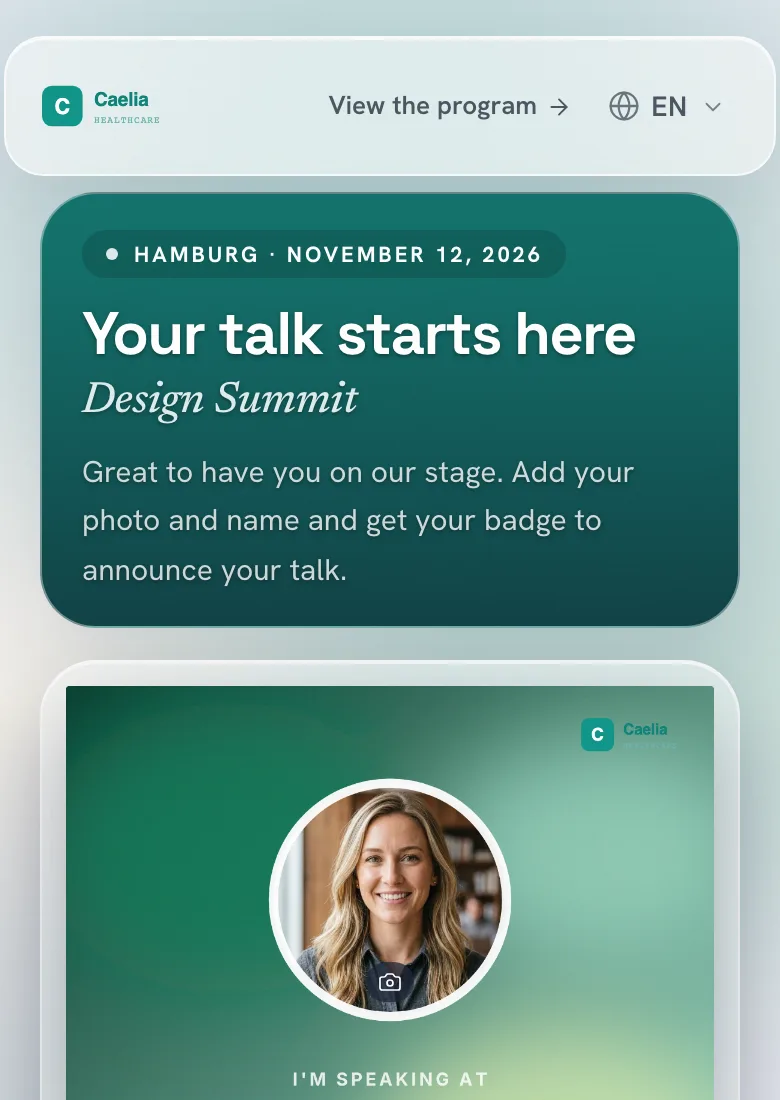
Under “Color style”, one click resets all the colors on the page, and the badge stays as it is. “Standard” shows the OneClickBadge colors. “From your badge” builds a light header from your badge's accent color, and “Bold” lets that color run into dark tones. There are also calm and glowing styles. If you change the badge's palette later, the page colors don't update by themselves. In that case, simply choose the color style again.
With “Custom style”, you set the colors yourself: page background, header area, text color (automatic if you like) and the color of the buttons and input fields.
Under “Logo and header”, you upload your own logo for the page header. Without your own logo, the header shows your badge's logo, or otherwise the event name. This logo applies only to the page. The badge and the link preview keep their own. You also decide whether a backing sits behind the logo, how large the page header is and what color the top bar has.
Cover image or link card: what appears when you share
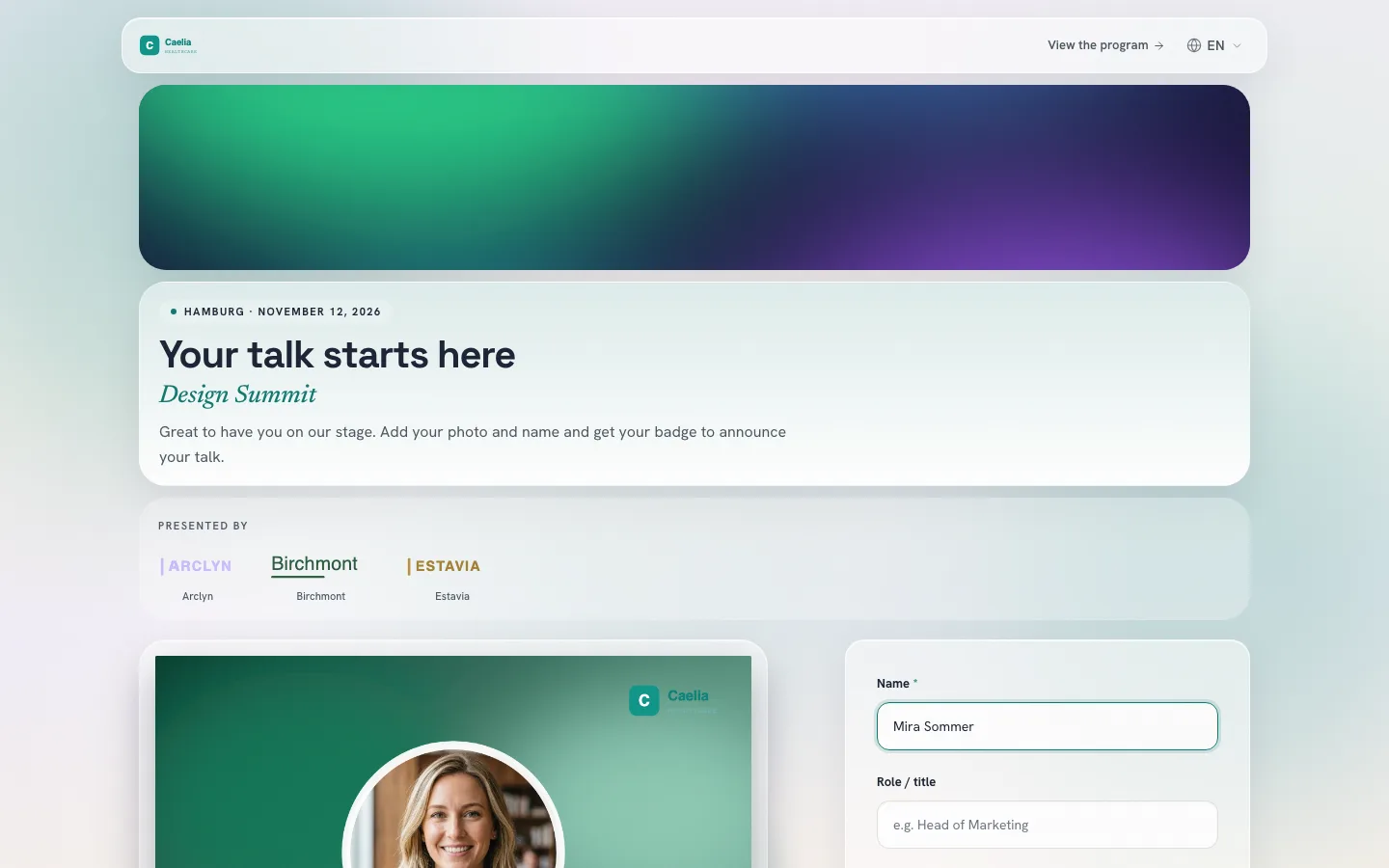
Under “Cover image”, you place a full-width image above the welcome message. Pick a subject that still works as a shallow strip, and move the image crop up or down. You can use images up to 10 MB.
Important before you send: once a cover image is saved, chats and networks show that image in place of the designed link card when your link is shared. Your welcome message then appears as the description. If you want the card to appear, leave out the cover image.
Texts: welcome message, form of address and field names
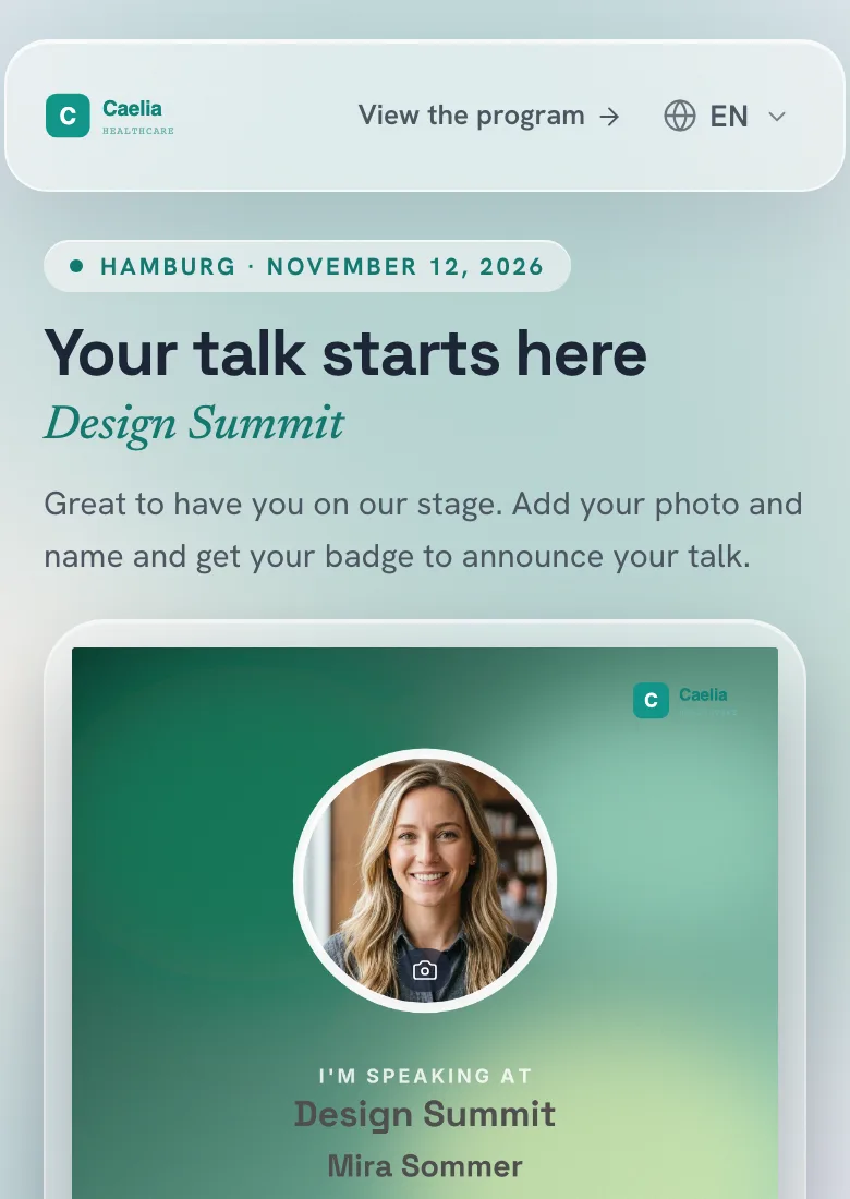
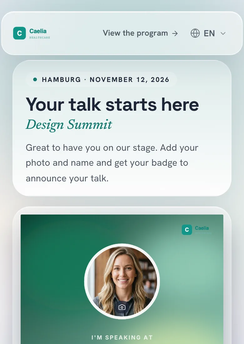
On the “Texts” tab, you write the Eyebrow, Headline and Welcome message. If the fields stay empty, the page shows a default text. Use the welcome message to say briefly what your guests should do next. Two examples to adapt:
Great to have you on our stage. Add your photo and your name and get your badge to announce your talk.
We're looking forward to seeing you at Design Summit. Create your personal badge with your photo and name and show your network that you'll be there.
Under “Form of address”, you choose whether the page speaks to your guests informally or formally. This switches the page's built-in text. Your own text stays the way you wrote it, and if it still uses the informal form, the editor points this out. The choice is available for languages that have a formal form of address.
Under “Form field names”, you name the input fields the way your guests will understand them, for example “Company or university”. Under “After saving”, you write what your guests see as soon as their badge is ready: a headline, a sentence below it and the note about the post text.
Event link, hashtag and sponsors
Under “Link to your event”, enter the address of your program or registration page. Give the button a name that says where it leads, for example “See the program”.
An event hashtag and your event link go into the suggested post text. This applies as long as you have the suggested text switched on and the guest hasn't already rewritten the suggestion themselves.
Under “Sponsors & partners”, you can show up to 30 logos, each with a name and website if you like, plus a heading such as “Presented by”. An entry without a logo isn't saved.
If you offer several badges through one shared link, the selection page has its own entry in the editor. It takes its colors and logo from the Speaker page, or otherwise from the Visitor page, until you change an area on the selection page itself. Its texts and layout are designed separately.
Link preview: the card for chats and networks
The “Design link preview” tile sits in the same “Customize” block. This is where you design the card that appears when your link is shared. The link's address stays the same.
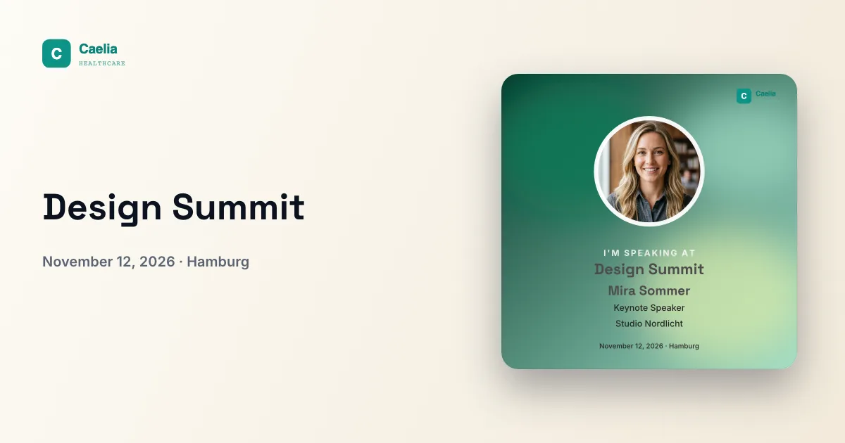
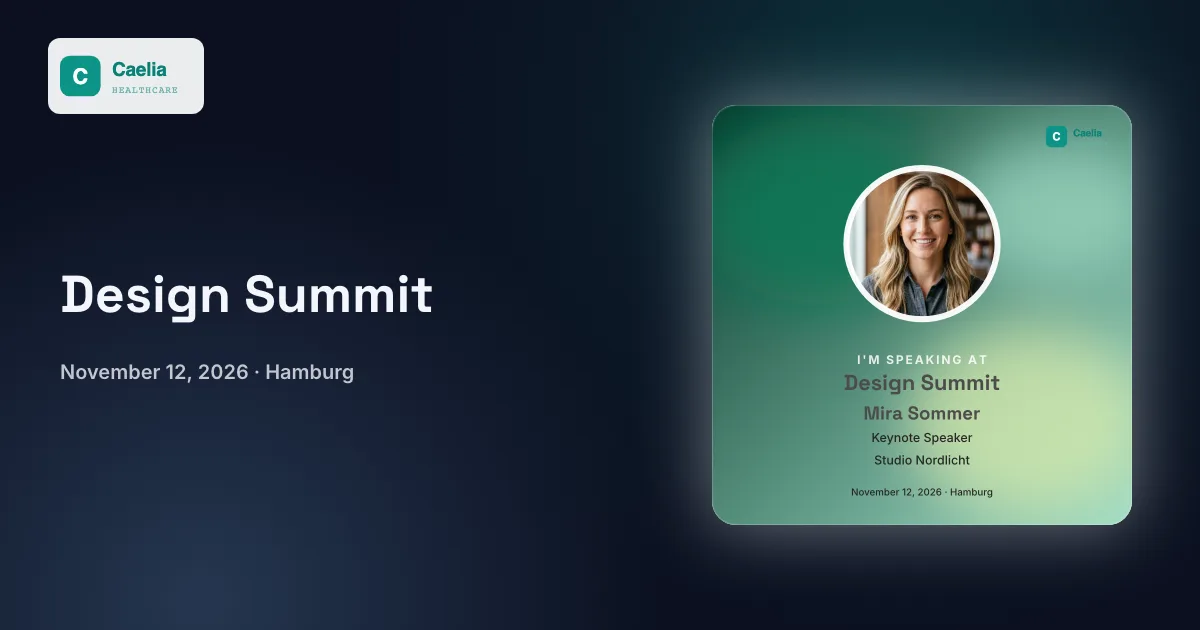
- Choose a style: “Color scheme” is preselected and uses your badge's colors. There are also “Cream”, “Dark”, “Custom color” and “Custom image”.
- With “Color scheme” and “Custom color”, you pick a shade from the palette, your own colors or a hex value. For “Custom image”, upload a PNG, JPEG or WebP up to 10 MB.
- Enter a title of up to 80 characters. If you leave it empty, the event name appears there. Decide whether the event logo appears on the card.
- If you have speaker and visitor badges, switch the preview between the two. Save with “Save card”.
The style applies to the speaker link and the visitor link together, but each badge gets its own card drawn with the matching image. Additional badges use the card of the badge they're based on. The card measures 1200 × 630 pixels. The shared link of the selection page shows the Speaker page's card, or otherwise the Visitor page's.
When the old link preview still appears
First check whether “Save card” went through and the dashboard shows the new card. Chats and networks often cache previews for a while, so test your link in a new message or a fresh draft.
On LinkedIn, the Post Inspector fetches the card again: enter the link, inspect it, done. The new card applies to new posts. Posts that are already live keep their previous preview, as the LinkedIn help article listed in the sources below explains.
Before sending: check it once as a guest
Open your link on a computer and on a phone, just as your guests will receive it.
- Are the logo, headline and form easy to read on both screens?
- Do the welcome message and badge suit the group receiving this link?
- Does the subject of the cover image stay visible, and should it appear in place of the card when the link is shared?
- Does the button lead to the right place, and is the hashtag correct?
- Can you create and download a badge with a test name and photo?
- Does a new message show the preview you expect?
Then the link is ready to go out. How to get your speakers to share it is covered in the guide Get speakers to post. The full plan for before and after the event is in Promote your event on LinkedIn.
Related
Already have an event? Open its dashboard and go to the “Customize” block.
Frequently asked questions
- Do I need an account to customize the pages?
- Yes, you design the recipient page and the link preview with a free account. Your speakers and guests don't need one. For them, the link is enough.
- Why don't I see my new page logo on the badge?
- The logo under “Logo and header” belongs only to the recipient page. The badge keeps the logo from its design, and the link preview uses the event logo, which you can show or hide there.
- Can speakers and visitors get different pages?
- Yes. Choose a single page at the top of the editor, for example the Speaker page. Changes then apply only there, including texts and field names.
- Why didn't the page change after I changed the badge's colors?
- The “From your badge” and “Bold” color styles take the accent color at the moment you click them. Choose the color style again after a color change, and the page will follow.
- Why does my shared link show the cover image instead of the card?
- If a cover image is saved on the recipient page, chats and networks use that image for the preview. Remove the cover image if you want the designed card to appear, then test the link in a new message.
- Can I change the address of my link?
- No, a custom domain or a freely chosen name isn't available. You can design the title and look of the preview. If you want to show the badges on your own event website, you can embed the selection page there.
- Does every service show the preview?
- OneClickBadge provides the card and the title. Whether a messenger or network turns them into a preview is up to that service. Test your most important channel with the real link.